| T | F | : | The correlation can be any number, but it is usually between |
|---|---|---|---|
| -1 and +1. | |||
| FALSE: Correlation must be between -1 and +1. | |||
| See item 1. at the bottom of p. 166 in the text. | |||
| T | F | : | If the distribution is bell shaped with no outliers, we expect IQR |
| will be smaller than s. | |||
| FALSE: It was stated in class that IQR is approximately | |||
| equal to 1.35 s for the normal distribution. You can | |||
| also figure this out from the tables. | |||
| T | F | : | Nonresponse bias refers to systematic error in sampling from a population |
| due to subjects being unavailable or refusing to reply. | |||
| TRUE: See bottom of p. 251 in the text. | |||
| T | F | : | One purpose of randomization in experimental design is to eliminate |
| confounding effects from lurking variables that might be | |||
| present in an observational study. | |||
| TRUE: This was stated in lecture. | |||
| T | F | : | Both the mean and the median are resistant measures of the center of |
| a distribution of data. | |||
| FALSE: See the bottom of p. 37 to the top of p. 38. |
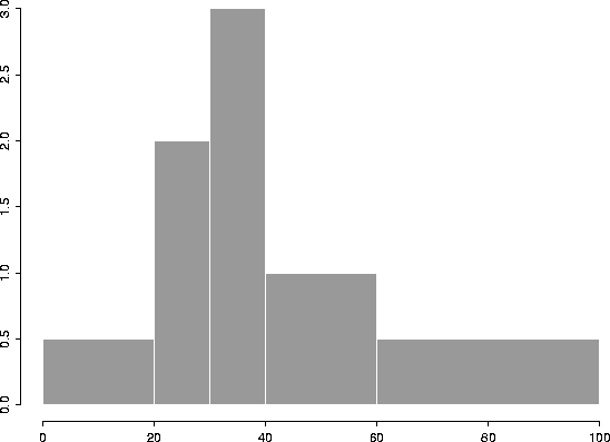
2. [30 points] Use the table below to sketch a density histogram for the data.
| Class | 1c|Percentage | 1c|Class | 1c|Bar | |
| 1c|Width | 1c|Height | |||
| 0 - 20 | 10% | 20 | 0.5 | |
| 20 - 30 | 20% | 10 | 2.0 | |
| 30 - 40 | 30% | 10 | 3.0 | |
| 40 - 60 | 20% | 20 | 1.0 | |
| 60 - 100 | 20% | 40 | 0.5 | |
We have added two extra columns in the table : one for class width and one for the height of the histogram bars. The plot appears below.
3. [30 points]
Suppose a data set has approximately a normal distribution with
mean ![]() = 200 and standard deviation s = 20.
= 200 and standard deviation s = 20.
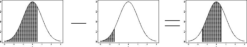
(a) Estimate the percentage of the data which are between 170 and 210.
Computing the corresponding z values:
From the tables provided, the area under the curve to the
left of z1 = -1.5 is 0.0668, and the area under the curve to the
left of z2 = 0.5 is 0.6915.
Thus, the area between them is
![]()
3(b) Find approximately the 80'th percentile of the data.
Using the tables, the 80'th percentile of the N(0,1) distribution is 0.84. The area corresponding the z = 0.84 is 0.7995, which is the closest we can get to 0.8. The corresponding data value is obtained by the ``inverse'' z-value transformation:
![]()
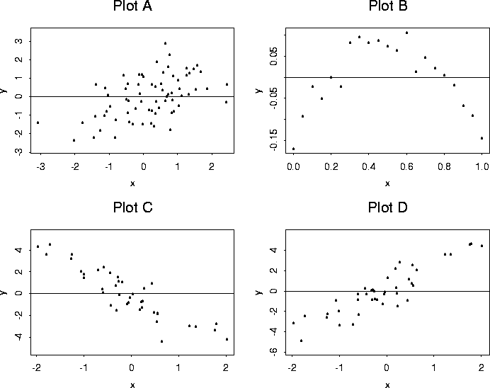
4. [20 points] Below are 5 values of r, the correlation of a sample, and 4 scatterplots. Match the value of r with the scatterplot by writing the plot label (A, B, C, or D) next to the value of r. Obviously, one value of r will be unmatched.
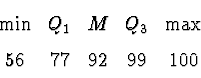
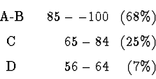
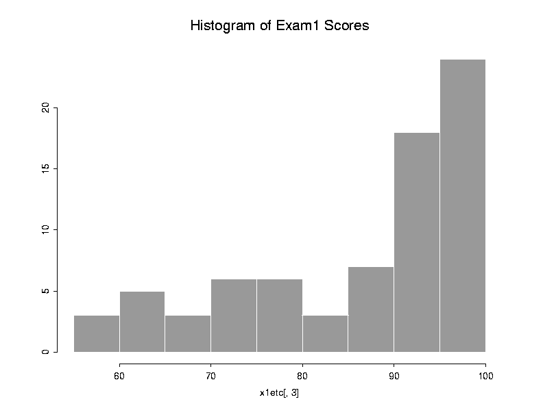
For n = 75 persons taking the exam before Fri., 13 Feb.:
![]()