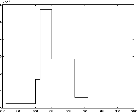
mean = 535, median = 500, mode = 500,
sd = 96, minimum = 220, maximum = 925,
5th percentile = 400, 10th percentile = 430,
90th percentile = 640, 95th percentile = 720.
What can you conclude about the shape of a histogram of this data? Explain your reasoning.
Solution: First of all, it should be ``these data,'' as ``data'' is a plural noun (plural of ``datum''). But it seems everyone forgets that. I see the mean is somewhat larger than the median and mode. Also, the maximum and higher (90th and 95th) percentiles are farther from the center (mean, median, or mode) than are the minimum and lower (5th and 10th) percentiles. This tells me the histogram is skewed to the right.
You can in fact plot a density histogram with the available information. Make the breakpoints for the class intervals equal to the given quantiles, divide the percentage in the class by the class interval width. For instance, there are 5% of the date between the minimum and the 5th percentile, so the height of the bars over the interval (220,400) is .05/(400-220). Similarly, there are 40% between the 10th and 50th percentiles. Thus, the height of the bar over (430,500) is .4/(500-430). A sketch of the histogram is below. It looks skewed right, sort of.