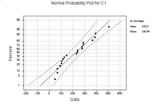
(a) The Normal probability plot appears below. The data are kind of ``clumped,'' but otherwise are more or less straight. There isn't strong evidence that the data are not normal.
(b) We will explain the Weibull probability plots in a manner which make things clearer than in the text, hopefully. We first show the Weibull distribution can be obtained from an Exponential distribution by a power transformation. Let
![]()
![]()
![]()
xi = G-1 ( (i-.5)/n )
and plot against them, but if y(1) < y(2) <![]()
![]()
![]()
So, the plan is to use exponential (with parameter 1) quantiles:
![]()
These (theoretical) quantiles for the exponential distribution are obtained by solving
![]()
![]()
![]()
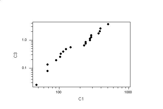
In order to do this in Minitab, we went to Calc -> Make Patterned Data -> Simple Sets of Numbers and stored the ``patterned data'' in C2, the data being ``First Value'' .5 to ``Last Value'' 19.5 in steps of 1 (this is (i-.5)/20 as i ranges from 1 to 20). Then we went back to the ``Calc'' menu, selected Calculator, and made C3 equal to - log(1-C2/20). Then we went to the ``Graph'' menu, selected ``Plot'', made the X variable C1 (the data) and the Y variable C3 (the theoretical quantiles) and selected ``Options'' to transform both axes by ``Logarithm.'' This produced the plot in the figure below. This looks about like a straight line, so it seems that the Weibull distribution is also a possible model for these data.
POSTSCRIPT:
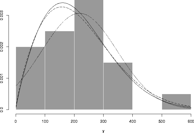
In order to figure this out, I plotted the histogram and overlaid
the plots of the densities of the normal distribution (with
parameters ![]() equal to the the sample mean
and variance
equal to the the sample mean
and variance ![]() ) and the Weibull density
(with parameters determined by fitting a straight line
to the probability plot, and also by maximum likelihood).
These appear below. It appears that neither model fits
very well, in fact. The normal model is clearly untenable
in this example as so much of the probability is on values
less than 0. Using the estimated parameters, the probability
of getting a value < 0 is 0.0467. Part of the problem is the small
sample size.
) and the Weibull density
(with parameters determined by fitting a straight line
to the probability plot, and also by maximum likelihood).
These appear below. It appears that neither model fits
very well, in fact. The normal model is clearly untenable
in this example as so much of the probability is on values
less than 0. Using the estimated parameters, the probability
of getting a value < 0 is 0.0467. Part of the problem is the small
sample size.
 |