3651
3645
3626
3634
3620.5
3607
3589
Note that there is one number per line. Here is the Splus code in which I read it into Splus and produced a time series plot, took logarithms and produced a time series plot of those, then took differences, did the time series plot, a normal QQ (Quantile-Quantile) plot (like a probability plot), and then plotted the acf function (recall that # indicates a comment; also ``_'' means assignment, but you can use ``<-'' (two keystrokes) or ``=''):
S-PLUS : Copyright (c) 1988, 1998 MathSoft, Inc.
S : Copyright Lucent Technologies, Inc.
Version 5.0 Release 3 for Sun SPARC, SunOS 5.5 : 1998
Working data will be in .Data
> dj_scan("dj.dat")
> tsplot(dj)
> #I'm using version 5.0 so I just issue
> # a plot command and the window pops up
> ldj_log10(dj)
> tsplot(ldj)
> #Doesn't look very much different from the other one
> dldj_diff(ldj)
> tsplot(dldj)
> #Looks pretty random
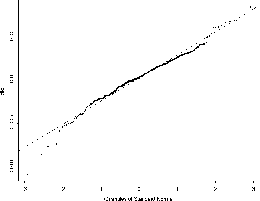
> qqnorm(dldj)
> #Hmm. Pretty straight. A suggestion of heavier than
> # normal tails, especially on the negative side.
> # Better overlay the line with intercept
> # equal to the mean and slope equal to the standard deviation.
> abline(mean(dldj),sqrt(var(dldj)))
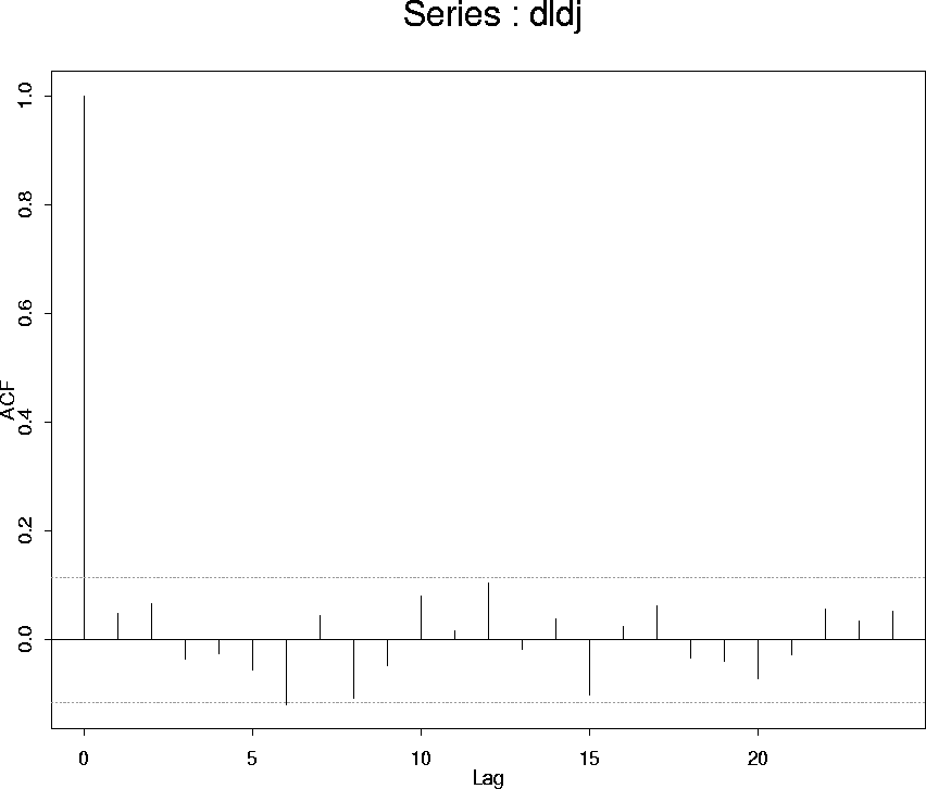
> acf(dldj)
$acf:
, , 1
[,1]
[1,] 1.00000000
[2,] 0.04788349
[3,] 0.06617524
[4,] -0.03567745
I broke it off because I forgot to assign the output of the
acf function to something so it just printed to my screen a
lot of numbers, which is pretty useless. Anyway, it also
produces a plot which is shown in Figure 1.
One sees that the plot provides reasonable evidence
that the differenced series is a white noise.